The brief for this project was to create letterforms from 'found' materials and base the letterforms on a chosen font, which we had to study.
I studied Parisian font, which is a sans serif based font. I created my letterforms below on this font, but also I wanted to include a serif based font. I chose Bemond for this font.
All my letterforms are created with the central theme of golf. Golf is one of my favourite hobbies, and there are a number of found materials that I could use from the create outdoors, and articles from the game itself.

These two letterforms are created in a sand bunker. I wanted to show the comparison between the upper and lower case Parisian font. The bunker works very well for creating the letterform as it enabled me to create clean lines and a nice shadow from the carving in the sand.


The above letterform is based on a Bemond upper case A. I used tee pegs, which work quite well for the straight lines but found it difficult to form the exact curved shape of the serif.

The above and below letterforms are based on the upper case and lower case Parisian font. The above letterform is made from a golf bag and golf shoe strings.
The below letterform is made from small stones found on the golf path. I think the contrast between the green grass background and the sandy coloured stones works really well and allows the letterform to stand out.
The below letterform is made from small stones found on the golf path. I think the contrast between the green grass background and the sandy coloured stones works really well and allows the letterform to stand out.

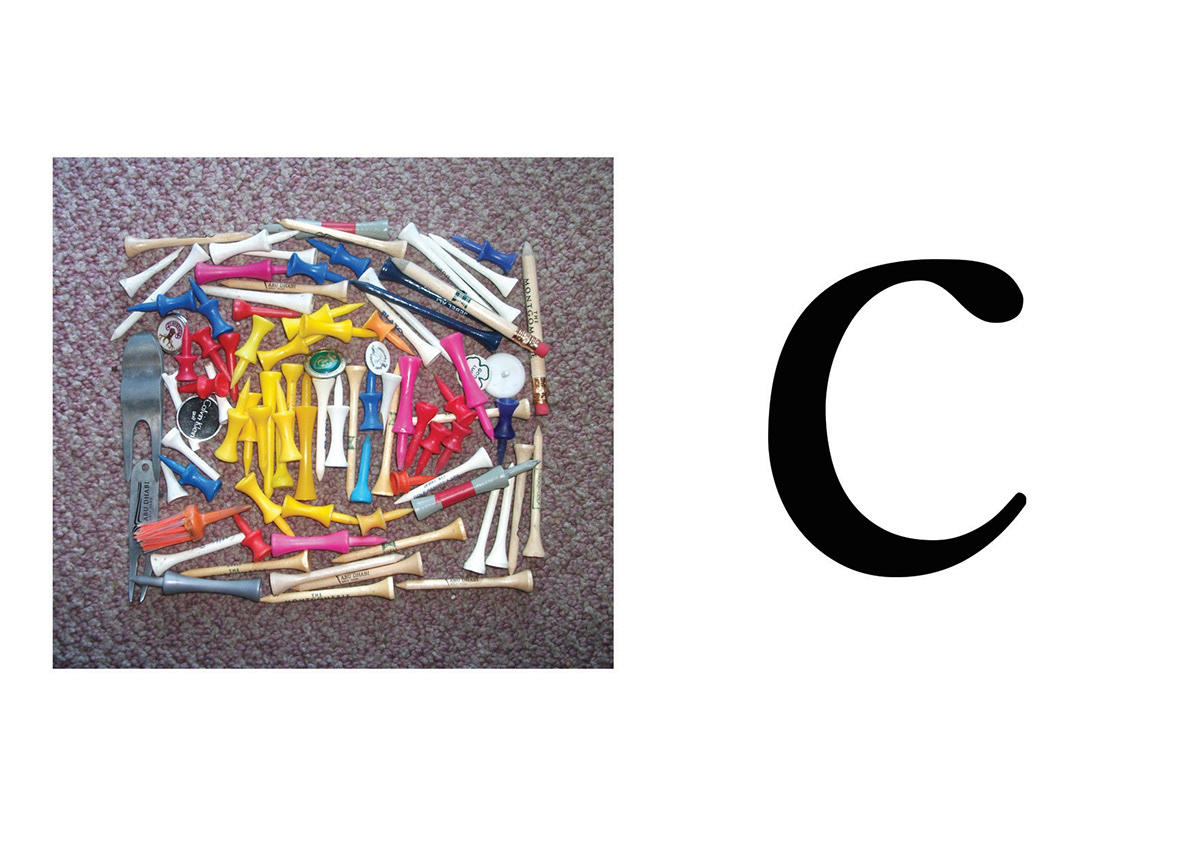
The above letterform has not worked at all but I wanted to include it to show what I was trying to create. I wanted to create the letterform from the negative space left from the tee pegs. I tried this with blank space shaped around the c, and the all yellow tees. However both didn't work. I this this is because of the multi-coloured tees. It probably would have worked better with tee of all one colour.

Learning from my first experiment with golf tees, with the above example I chose to create the letterform from the tees and have a traditional background as the negative space. I also chose two close shades of tee, rather than multiple colours. I feel this is a much better effect and is based on an uppercase Bemond font.


The above two letterforms based on lowercase Bemond font are some of my favourites. I think they worked very well with the contrast between the green grass and brown leaves. It was difficult to create these letterforms as the wind kept blowing the leaves away, but also the leaves are a difficult material to shape the straight lines and curved serif's. They were worth the effort though as they stand out and are quite dramatic.

This is another of my favourite letterforms. Based on a lowercase Bemond font, I used divots shaped around a golf hole to create the curved lines and serif. To get the shape and thickness I wanted took some perservance and pressing and re-shaping of the grass pieces. I like the contrast between the dark shadow of the golf hole and the darker background grass, and the lighter, yellowing divots.

The above letterform is based on an upper case Parisian font and is created using flagsticks, golf club head covers and a golf towel. The thin golf flagsticks worked well to represent the thin upright sides and the other golf equipment works nicely to created the thicker diagonal section.

I based the above letterform on a lowercase Parisian font and I used the golf hole with a golf glove arranged in the hole to represent the thicker left side.

The above letterform is based on a Parisian lowercase font. It is created from a golf club head cover and a golf shoe lace. The shoe lace worked nicely to created the sweeping curve, whilst the headcover represented the thicker part of the font nicely.

The letterform is created from a golf umbrella, golf flag stick and two golf gloves. I used the negative space between the umbrella and flagstick to create the thick vertical section. The top diagonal section was created with the actual flag section set at an angle. I shaped two golf gloves to create the very thin horizontal sections.

This letterform is created using golf clubs and flagsticks and is based on an uppercase Parisian font. The flagsticks work very nicely for the thin sections, whilst I used two golf clubs parallel to each other with the negative space inbetween to create the thicker sections. I had to angle the clubheads to represent the bottom points and the top flatter edges.

